I’ve been beta testing Outlook.com for a month now and I like it. Finally Microsoft got it right with a simple and uncomplicated web based email experience. Best of all, now anyone can experience Outlook.com. Simply switch your Hotmail account over to the new UI or create a new account at Outlook.com. Here are the top ten reasons this new UI works for me.
- Speed – It’s faster than Gmail and Yahoo. Between the initial loading and the time it takes to render some messages, I’m just tired of dealing with Gmail’s delays (are you listening Google?). My Hotmail account with the new Outlook.com UI feels nice and snappy and it has roughly the same number of emails as my Gmail account.
- Inbox Sub-folders – Outlook.com has ’em, Gmail doesn’t. No more jerry rigging labels and filters for hours to sorta do what you want.
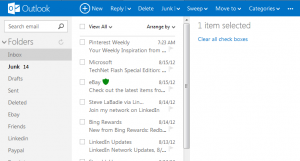
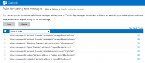
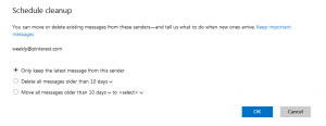
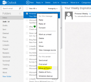
- Simple rules – Wanna move all messages from someone to a sub folder? That’s easy and now you can do it right from the message itself. No more copying email addresses to clipboards or navigating through tons of settings. Just 2 clicks and you’ve got a rule that filters specific messages to the sub folder of your choice. You can create a cleanup schedule for specific messages.
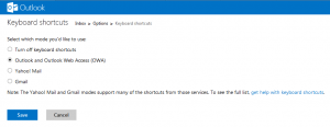
- Up/Down/Delete key support – When I navigate through unread emails, I want to quickly preview and mark messages as read using the up/down arrow keys on my keyboard. I can do it with Outlook.com. Gmail keystrokes are also supported but i could only ever remember j/k.
- Right-click context menu – The right-click context menu allows me quickly get common tasks done without having to go to the prescribed menu buttons. Replying to a message or creating a new folder can be done without moving the pointer to a specific link.
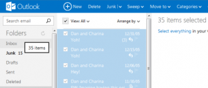
- Drag and drop support – Select a bunch of emails and drag ’em to a sub folder. Do this all day long and it’s easy in Outlook.com.
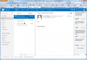
- Side by side reading pane – I’ve gotten used to this with Outlook 2010 and it really does reduce the need to scroll. If you prefer the top/bottom or no preview pane, you can set it in Outlook.com.
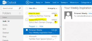
- Flagged emails stay at the top – What a great idea. Rather than hunting through your inbox to find messages you’ve flagged, they stay at the top so you can easily follow up. It’s like important emails in Gmail, but better.
- Categories and QuickViews – This is kind of like labels in Outlook, but unrelated to folders. You can categorize emails regardless of their folder location and create a Quick View to list them all regardless of which folder they’re physically located in.
- The image attachment slideshow viewer – It’s great for viewing emails with multiple picture attachments.

Alrighty Google…the pressure is on to do something with Sparrow. I expect my Gmail to be faster and more useful soon or I’m permanently switching to back to Hotmail/Outlook.com.
Comments
3 responses to “10 Reasons to love the new Outlook.com”
Honorable mentions / runners up:
#11 Unlimited storage space. No gimmicks, no kidding.
#12 The ability to easily recover your deleted messages.
#13 Unlimited email aliases / disposable email addresses.
#14 Send and receive larger attachments (bigger than 25MB) via SkyDrive.
#15 Sort by message size.
I’m not a massive fan of Gmail and really want to migrate to Outlook.com for all the reasons you mention (but can’t for the reason I’ll mention in a minute), but I have to point out that some of your criticisms of Gmail aren’t fair. It DOES allow sub-folders – just create a new label and nest it under an existing one. And it’s nowhere near as hard to move a bunch of messages from a specific sender to a subfolder as you suggest. Just search for their name, select all, and move. It couldn’t be very much easier.
The problem stopping me migrating is one great feature which Gmail has and Outlook.com doesn’t, which I’ve come to rely on. It allows you to apply MULTIPLE labels to a message. This is far more powerful than folders. Got a message from my girlfriend about our summer holiday flight details – does it go in the folder where I keep emails from my girlfriend, or the one I created to collect information about the holiday? Where would I look for it in future? With Gmail I don’t have to decide – just apply both labels to it. Labels are almost identical to folders, but that key distinction makes them much more powerful.
Good point Phillip. Hadn’t thought of that but it is a valid concern and does illustrate the power of labels vs. folders. Then again, you could use Categories in Outlook.com for this as well. You can apply mulitple categories to one email and you can filter emails or search by category.