Dear Google, I understand that your primary focus for development of mobile Apps is the android platform, but that shouldn’t be an excuse to slack on building apps for other platforms. Especially if it involves your second endeavor into Social Media. Shouldn’t the focus here be to make your social network as accessible and functional as possible on all platforms? I use the iPhone and I’ve been patiently waiting for the Google+ iPhone App to get better with time. It hasn’t happened and I am officially sad about it.
You’d think with all the cash Google has, they’d stop neglecting products so quickly after the initial launch. It’s not like Facebook is sitting back and taking it easy. Nope, they’re improving things and fixing bugs…with one small difference – they already have a mobile app that works pretty well.
Before I continue on this rant though, let me spend a bit of time talking about the features of the Google+ app for the iPhone. I mean it does generally do what it should: For instance, it lets you post location based updates with optional pictures or video to your circles from your phone. It lets you see the updates of people in your circles, what’s hot or even people near by – that’s kind of unique. It lets you look through posted photos of your friends or self with relative ease. It lets you chat with friends and update your profile. These are all good general features to have and they work relatively well.
Here are the features that don’t work well and that get me po’d. First on my list is the notification system. When I get a notification number on the App and open it to see the notification, I often find that I’ve been signed out and need to sign back in before I do anything. Once signed in, I’m taken to the home screen not the place I was at before. Finally, when I do look at the notifications screen it says that there are no new notifications for me. Only when I go into the actual notifications and pull down to refresh am I able to view the notification that is waiting there for me.
Next is automatic picture uploading and notifications that pictures I have taken on my mobile device are available for sharing. I don’t want Google+ to start quietly uploading images from my picture library. If I want to post a picture from my library, there’s already functionality for that. Auto-uploading my last taken image to Google so it is ready for quick posting is just creepy and not useful.
Loading. Getting to the home screen is tedious on 3G. I understand that this App is mostly a front end to the web, but maybe that means developers should store some more stuff locally. The time it takes for this app to load is excruciating. I want to be able to see what’s going on now…not have to stare at a white screen with a Google logo.
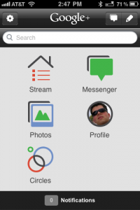
Finally the home screen icons. I understand that there are five main things to do…but why organize them like this:
Maybe make the buttons just a tad smaller and put the post and notifications icon on the home screen? Why hide it in the top corner? This makes no sense to me.
So there you have it. My review of the Google+ app for the iPhone. In short, it could be a lot better.

Comments
One response to “Google+ App for the iPhone”
I wholeheartedly agree with all the issues that plagued the old g+ app for iPhone. Especially the sentiment that it represents a big broken part of the new google social network.
That said, the newly updated google plus app for iPhone is a lot slicker and they pretty much addressed all the issues you brought up in your post.
The log out issue has been fixed.
The main screen now simply shows your feed.
Instant upload can be configured to work only on wifi or be turned off completely.
Hope it’s enough to get people to give g+ another look.